


Accessible Packaging Design: How We Create Inclusive Solutions
An elderly man needs help opening his medication because his strength isn’t what it used to be. A woman with a prosthetic arm struggles to open consumer product packaging. A man who’s colorblind has trouble distinguishing between drink flavors as he tries to pick a beverage carton from the shelf.
These people represent the 27% of the world's population that has a disability and could benefit from more accessible packaging. Additionally, when including family and friends, disability impacts 63% of the population, representing an estimated $13 trillion in consumer spending. The numbers can be surprising to some since a significant majority of disabilities are “non-apparent,” meaning they can’t be readily seen or understood by others.
Because of the prevalence of people with limitations, our designers are often challenged with designing for inclusivity and accessibility, especially when our customers know a good portion of their target audience may be differently abled. Here are some of the ways they design with disabilities in mind.
Designing accessible packaging for adherence
International standards on accessibility typically serve as recommendations, but depending on the region, there are some requirements. Our experts often design packaging specifically to adhere to those accessibility requirements.Both Europe and the U.S. require the packaging of certain products to be child-resistant as well as “senior friendly,” meaning a majority of seniors can open and close the packaging within minutes. This applies to many health and pharmaceutical products, as well as those considered toxic, such as insecticides. Products like these that are required to have child-resistant packaging could also provide a challenge for seniors with limited dexterity or strength. Once packaging is designed, our teams use third-party organizations to test and certify that packaging meets all child-resistance and senior-friendly standards.

Designing accessible packaging for customer experience
Manufacturers will ask for greater accessibility and inclusivity above what’s required when they know it’s important to their consumers. For example, products might be made specifically for seniors or those with certain health conditions, such as Parkinson’s or hand injuries. In this case, designers have to identify the limitations of that audience and then design packaging feature for them.“Our designers did some training with NC State University where we were put in various situations, like wearing a neck brace or wearing goggles that obscured vision. This simulated different physical and visual limitations so we could understand what actions are more difficult,” said Steve Jones, Smurfit Westrock packaging design director.
Putting themselves in the shoes of the consumer, designers include features, such as changing the placement of buttons for those with arthritis or creating low-force openings for those with limited grip strength. Then, they test usability with focus groups made up of members from the target consumer group.
“We may run the focus group, or the customer may run it, and the packaging includes the tactile features we created as well as the graphics and instructions,” said Jones. “We’ll look at what they struggle with and why, whether it’s understanding how to open it or being able to physically open it. The customer might ask if we can make it easier to manage or more intuitive.”
Designers then use the insights they gather from the focus group to revise and perfect the packaging, both the instructional graphics and the design itself.
Designing easy to open packaging for any user

“In pharma, packaging has to be both child resistant and senior friendly,” said Marty Jones, Smurfit Westrock senior manager of packaging design. “You can build it like a steel trap, but then seniors may not be able to get into it. So, it’s a very fine line of designing specific features that small children can’t get through but seniors can.”
For greater tactile access, consider easy-open structural designs:
- Low-force openings
- Tear strips with tabs
- Larger pull zones or pull handles
- Avoiding tightly sealed shrink wrap
Also, create more stable forms that are one-hand friendly by including:
- Intuitive grip zones, grip-able without having to squeeze or pinch
- Rounded edges and larger tabs
- The ability for it to be stable when placed on a flat surface
“Across consumer packaging design, we soften the corners of packaging because we're considering the population of people with smaller hands who need to grip the product. We’re thinking more about ergonomics,” said Steve Jones.
To give its packaging greater tactile access, OLAY Beauty added a special feature to its Regenerist cream. The limited-edition packaging has a twist-off lid with a grip lever, making it easier for those with issues like arthritis or low grip strength. Accessible beauty brand Meloway made lipstick packaging more user-friendly with an innovative capless design. Other features that make packaging easier to open or handle might be overlooked by those without disabilities.
“A good example is creating small openings for handles on 12-pack canned beverage cartons so that they’re easier to pick up from the retail shelf and put it in a cart or in your car,” said Nipun Marwah, Smurfit Westrock account manager.
Designing packaging with visual impairments in mind

While the legally blind represents a small part of the population, almost one-third of the world has some visual impairment. Many use glasses or contacts to correct their vision, but there are always occasions when someone forgets or loses their corrective lenses.
There are also those with partial visual impairments, like glaucoma, and then, those who are color blind, which is one in 12 men and one in 200 women. For those with color blindness, distinguishing between certain colors is impossible, and complex graphics may create much confusion.
Our designers focus on these design elements to ensure the visually impaired have a better experience:
High color contrast
- High contrast between the text and the background ensures copy remains readable by those with impaired vision.
- Bolder, thicker fonts are more easily read. However, using higher contrast with thinner fonts can help.
Legible typography
- Use larger-than-average font sizes.
- Avoid decorative, condensed, or script fonts.
- Use sensible text hierarchy to make information scannable.
Avoid reliance on color
For instructions, warnings, or product distinctions, never rely solely on color. Use:
- Icons and symbols
- Patterns
- Labels
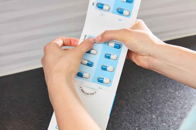
“Instructions on our packaging are well thought out by people who've been designing for limitations for years now,” said Marty Jones. “They know how to create the right graphics for communicating opening and usage instructions, actually showing imagery of hands holding the package. It shows where the thumb presses and where the other fingers grab, for example, a pill card to pull out.”
Clear, Simple Layouts
- Minimize clutter and increase clarity with simplicity.
- Large hero images
- Grouping like items
Tactile markings
- Braille product names
- Raised icons to indicate the product category (e.g., shampoo vs. conditioner)
- Tactile arrows showing opening direction
- Even when Braille is not feasible, tactile differentiation on structural panels helps users orient the package.

New technology is also making packaging more accessible to the visually impaired. Pantene recently adapted their packaging to include NaviLens codes. NaviLens is an app for the visually impaired that enables their phones to scan any NaviLens code within 15 meters (around 50 feet). When the phone scans the code, it provides audible information about the product. Because those who are blind can’t tell whether their phones are properly aligned on QR codes making it harder to access connected information, NaviLens makes the process easier by solely requiring someone to have their phone in range of a code.
Inclusive packaging design and what it means for your brand
Whether designers specifically create packaging for those with limitations or not, they aim for ease of use and a pleasurable customer experience. Features like clear and simple graphics, the use of icons, and low-force closures make it easier for everyone to use and enjoy engaging with a product, which is good for branding. Additionally, keeping those with physical limitations in mind when designing helps boost brand engagement as, according to a Misfit Media analysis, 73% of consumers are willing to switch to a more inclusive competitor brand, even at a higher price point. Events like the Paralympics and National Disability Independence Day (July 26) are natural moments to spotlight inclusive packaging design as a brand differentiator.Contact our team of experienced designers to learn how inclusive packaging can strengthen your brand and expand your reach to consumers impacted by disabilities.
Share:
Our Latest Blogs

Forest Biodiversity: How Our Foresters Protect and Restore Healthy Ecosystems
Read more
How the countdown calendar trend is spurring packaging design innovation

Eco-friendly packaging explained: How to describe sustainable products meaningfully

How to reduce operational costs with packaging

Beer Packaging Trends for Sustainability and More

Request a call with one of our packaging experts
Contact
Submit our form and we'll get back to you as soon as we can.